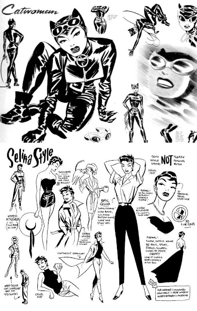
One of my silly little “reading goals” for 2022 was revisiting all things Darwyn Cooke – from his early work on Catwoman to the Parker novels late into his career. Cooke is, in my opinion, a giant of the medium. Compared to his peers, he ventured into comics quite late, after spending years as a graphic designer for magazines in Canada and then as a storyboard artist in Los Angeles for various shows of the DCAU. But what that also meant was that he was able to bring in and apply the lessons learnt and experience gained from those industries into his comics. His character design is timeless – look no further than his character sheet for Selina Kyle / Catwoman – and his storytelling is sharp and crisp.
Going through Cooke’s works as I did, you can see a clear fascination for the look and style of post-war America – the architecture, the cars, the furniture – but, unlike most creators who choose to set their works in that time period, Cooke wasn’t shy to deal with the things America likes to ignore when it takes a look back at its “Golden Age” – racism, McCarthyism, war and its consequences. In fact, in the annotations for The New Frontier, Cooke’s epic for DC Comics that tries to bridge the gap between its Golden Age and Silver Age characters, he writes: “Any effort to insinuate the DCU into the real world of the 1950s wouldn’t have been complete without looking at the civil rights issues of the day. The problem was DC catered to white culture and there were very few black characters to explore this theme.” Cooke settled on John Henry, but that comment offers us a look behind the curtain, so to speak, at the man himself.
Another point of note, as you go through Cooke’s work as I did – and perhaps this is something that becomes quite obvious when you consume a creator’s work in one go – is you can see how they were at three prominent stages of their career – the beginning, when they had just broken into the industry; the middle, when they were at the height of their powers; and the end. And while it would be interesting to compare those three eras of Cooke’s career, I am more interested in discussing something else that caught my eye.
You can break Cooke’s work into three categories, or genres, if you’d like: superheroes, crime, and the intersection of superheroes and crime. Specifically, I am interested in understanding how Cooke tweaked his storytelling, particularly the panel work, when he was doing a superhero epic (DC: The New Frontier), when he was doing a heist story (Richard Stark’s Parker: The Score
), and when he was doing a heist story set in the world of superheroes (Catwoman: Selina’s Big Score
).
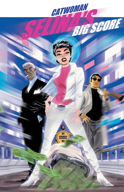
We begin with Selina’s Big Score. Released in 2002, it is a 96-page graphic novel that acts as a prelude to the 2001 Catwoman series, of which Cooke illustrated the first arc (#1-4, “Anodyne”). Even though it is from a publisher that predominantly puts out superhero comics and features characters from that world, you could argue that Selina’s Big Score is, essentially, a crime comic book. That is true not because there aren’t any caped crusaders in this story, but because of how the book looks as you flip through its pages.
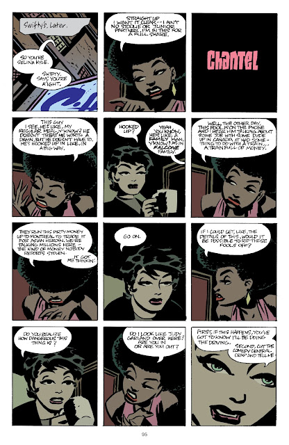
Traditionally, there are certain elements that creators tend to employ in a crime comic book story. You will see heavy shadows, tight panels, and the occasional shift in perspective with clever use of Dutch angles. While you will get plenty of those in Selina’s Big Score, it struck me how a big chunk of the book is done in a tight four-tier per page structure, almost as if Cooke chooses to limit himself to that. This is quite unusual because most comic book pages follow a three-tier structure: setup, beat, punchline. A four-tier structure, particularly the one Cooke employs throughout Selina’s Big Score, that of twelve panels per page, can feel overwhelming – there is simply too much going on on a page. It speaks volumes on Cooke’s command of his storytelling that it isn’t so in this book. You will see panels on panels, stacked one over the other, but it never gets in the way of the scene that Cooke is trying to tell on that page.
Consider the following page. This is early in the book, as we are introduced to the characters that make up the story and to the elements of the heist that they are trying to pull off. Here, Cooke establishes the location in the first panel and then uses shot / reverse shot to let us know that there is a certain level of distrust between the players here, as we watch this verbal tennis match of wits between them. You don’t even need to read the dialogues on this page to know who wins that tennis match; it is already conveyed through the characters’ body language. Chantel starts off strong, pointing at and pushing into Selina’s space, so much so that the cool and collected Catwoman has to rise up to meet Chantel’s challenge, gradually “moving” from her place in the lower-left corner of her panels to ever so slightly towards the right, ending on a panel with absolute focus on her, essentially outmaneuvering Chantel at her own game and coming on top. This is reinforced in how Cooke keeps Selina on the center of the page – it’s still her show. At the same time, on an already loaded page brimming with word balloons and subtle character work, he somehow also manages to dedicate an entire panel for a stylized introduction to Chantel, a common troupe of heist films.
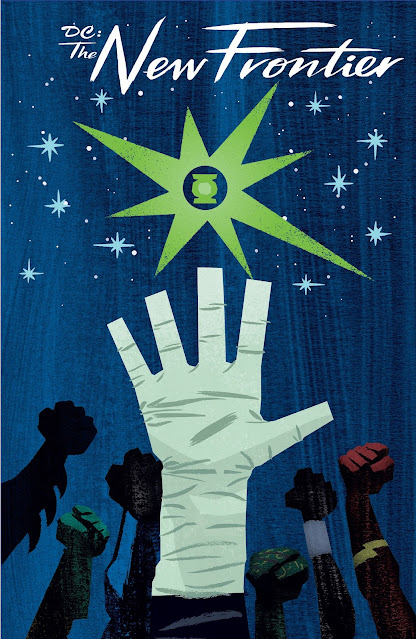
Next up is the 2004 limited series The New Frontier. As I mentioned earlier, this is Cooke’s superhero epic that aims to bring DC Comics’ Golden Age characters – Superman, Batman, Wonder Woman – into the 60s and introduce its Silver Age characters – Flash, Green Lantern, Martian Manhunter. Much like how Cooke employed the tried and tested tools of crime comic storytelling but then built on those for Selina’s Big Score, he does so with superhero comics in The New Frontier. For example, while over the years, “realism” has become the norm in superhero comics, with artists adding as many details as humanly possible into the tiniest panel, the core idea hasn’t changed: You want clean lines that make it easy for the readers to follow the action, especially when you are doing big action sequences. Cooke does plenty of that in The New Frontier, but clean lines aren’t the only thing that make this book so good.
Cooke follows a strict three widescreen panels per page structure throughout The New Frontier. It feels like a cross between the then and the now, between the three-panel structure reminiscent of classic newspaper strips, that offered a clear setup, beat, punchline all in one go, and the “widescreen comics” popularized by Bryan Hitch in the late 1990s / early 2000s with his work on The Authority and The Ultimates.
Take a look at the page below. Even without the context, you get a clear idea of what’s going on here. The first panel sets up not just the location, so you know where we are in the story’s world, but it also informs you of the sheer scale of the things at stake here. You see this grisly mixture of fire and water – of burning human and alien flesh falling into this great wave off the Atlantic – punctuated by a red superhuman streak. The second panel is the beat, that adds to the plot and gives you the additional details you might need to fully contextualize the scene here.
TL;DR: Our hero has arrived and is faced with insurmountable odds. The third and the final panel is the punchline. Here, Flash needs to do what he does best: Run.
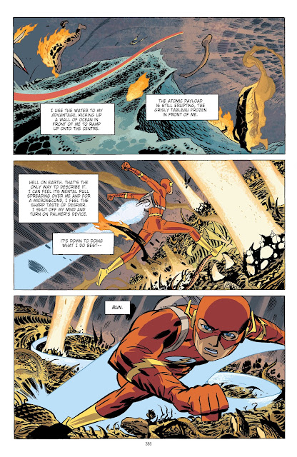
It looks deceivingly simple, but this is something that is incredibly hard to pull off right. It is a testament of Cooke’s mastery over his storytelling that he makes it look so easy. Almost every page in The New Frontier is either a standalone or stands on its own in the scene Cooke is trying to tell over multiple pages. Even when he breaks the three-panel structure, he follows the same structure within the panel he broke it for. At the same time, restricting yourself to a particular structure/layout throughout a book also means that when you do break the mould for a splash or a double spread, it hits the reader with twice the impact. Once you realize that you also start to understand why Cooke may have chosen to stick with that three widescreen panels per page structure so vehemently throughout The New Frontier.
Finally, we look at the Parker novels. In 2009, IDW Publishing contracted Cooke to adapt four novels from Donald E. Westlake’s Parker series. Parker is Westlake’s – the grandmaster of crime fiction – most famous creation, starring in over twenty novels Westlake wrote under the “Richard Stark” pseudonym. While all four of Cooke’s adaptations – The Hunter, The Outfit, The Score, Slayground – are excellent in their own right, I want to discuss the third book in that series, The Score, since it is a heist story, front and center, much like how Selina’s Big Score is, except that it is not set in the world of superheroes.
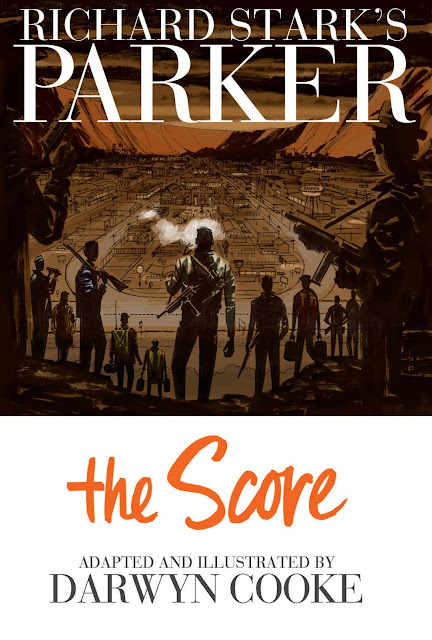
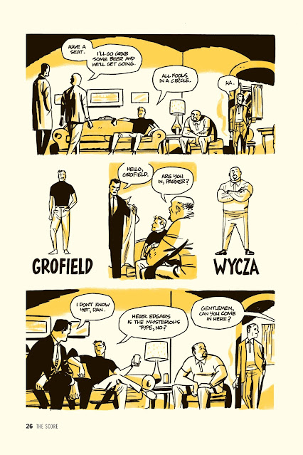
Coming off Selina’s Big Score and The New Frontier, the first thing you notice as you flip through the pages of The Score is how it looks like it is the best of both worlds – Cooke still does tight panels because it is a crime comic book story, but perhaps also applies the lessons learnt from his work on superhero comics to open it up when it fits. The heavy shadows are even heavier, the stylized introductions even more stylized, but the overall panel structure feels looser and, dare I say, less restrictive. A “looser” structure, so to speak, also allows Cooke to experiment and, I would argue, adapt from his source better.
Let’s consider an example. Take a look at this page from The Score. Much like the page we discussed for Selina’s Big Score, this is early in the book, before the heist. Notice how Cooke plays with the layout here. We open with a wide panel that introduces three new characters in one go. Parker knows Grofield and Wycza already, so we get a tight on the three of them in the next tier of the page where the central idea of the scene is reinforced with the panel right in the center of the page: “Are you in, Parker?” This panel is flagged by two on either side, offering a stylized introduction to the characters we just met– again, as we established before, a common troupe of heist films. We go to a wide again where, essentially, it is two scenes in one. We get the continuation of the chat from the previous panels and we see that the players are being called into the next room.
Cooke could have broken this page down, into a nine-panel grid, for example, and you can see that it could work, but while I do love me some nine-panel grid, doing the two scenes in the first and third tier of the page as wide panels feels more natural, as if many things are happening at the same moment. C’est la vie, as the French say.
These are some very specific examples, with a particular eye towards the way he structures his page and breaks it down into panels for stories across different genres, but there is a lot of cool stuff lurking under the pages of Cooke’s impressive body of work. For example, hunt down Detective Comics #439 (1974) for “Night of the Stalker!” by Steve Englehart, Vin and Sal Amendola, et al. and then see Cooke remake it as “Déjà Vu” in Solo #5 (2005) for an absolute masterclass on how to do more with less.
Leave a Reply