It had to happen. We had to talk about Rob Liefeld. The man is, and always will be, an enormous figure in the comics field. So big that the gravity he exerts pulls all blogposts towards him.
But I did not want to make the standard Rob Liefeld article. I didn’t want to make pouch and feet jokes or take cheap shots at his infamous Captain America drawing. These things are tired and unhelpful. Instead, I will try my best to put jokes aside because Rob Liefeld deserves many, many things… but not humor.
Style Notes:
- Iconic style: You can tell a Rob Liefeld drawing from across the room. Wild costumes, exaggerated proportions, dynamic poses. The books just scream excitement. Then there’s his writing, which feels like a Michael Bay movie powered by irradiated cocaine.
- Poor technique: For most of his career, Rob Liefeld had no real formal training in anything. Not in drawing, not in writing, not in anything. As a result, there are some real fundamental mistakes — not problems, mistakes — with much of his output.
- Spectacular Marketing: Rob Liefeld can absolutely sell a book. In fact, Rob is one of the few people to consistently sell multiple versions of his books.
Starting at DC Comics
From the very beginning, Rob Liefeld was a stand-out talent. As you’d expect, editors showed reservations over Rob’s fundamentals (Gary Carlson, the editor at Megaton Comics, referred to it charitably as “some goofy anatomy.”) Liefeld’s character designs had just enough George Perez in it to feel comfortable, and his sequencing was clear enough to convey a story.
Unfortunately, much of Liefeld’s early work was never published or was redrawn by other artists by editorial edict. I want to pause here and wonder what this output looked like. Did it benefit from Liefeld being younger, eager, and more open to guidance? Or did it suffer from inexperience and a lack of practical knowledge?
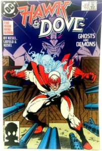
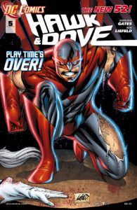
We can see hints of answers in the Hawk & Dove miniseries that actually did get published. And credit where credit is due, Liefeld’s idea to represent an alternate dimension by turning the comic on its side was a good idea. It was good solution for how to challenge the reader… without all the hard work that a Ditko, Steranko, or Kirby execution would require.
Regardless, I contend that this moment here represents the height of Rob’s technical skill (as shown by the comparison above.) His characters are better proportioned. Their posing and locomotion feel much more naturalistic. Even his panels are less crowded.
X-Force
Technically, the seeds for X-Force begin with Rob’s takeover of The New Mutants in 1989. Rob would initially be partnered with the staggeringly brilliant Louise Simonson on that run, only to eventually takeover art and plotting duties (with Fabian Nicieza on scripts). The whole run lasted from New Mutants #86-100. And while this is an important period in for Marvel, the X-Book line, and New Mutants itself, I want to fast forward to X-Force #1 (1991)
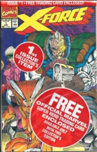 Collector’s Issue
X-Force #1 was an absolute bombshell and one that catapulted Rob into the forefront of comics discussion. Part of this was due to Rob’s marketing genius. He saw the wave of speculators coming into the comic market, looking for the next big thing to collect for quick cash, and he made the most of it by riding their thirst for “First Issues.” Each issue of X-Force #1 was packed with:
- A certificate of authenticity
- 1 of 5 potential trading cards
- sealed inside of a polybag emblazoned with four separate “limited edition” notices.
- And there was a hand-signed limited variant of each edition. (Containing only Rob’s signature, I believe)
This adds up for a total of 10 potential collectors editions, which lead to astronomical sales. If Claremont/Lee’s X-Men #1 hadn’t come out, it’s possible that X-Force #1 would have been the comic of the decade.
This book was peak-Liefeld. Which means, we can only go down from here.
 Artwork
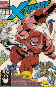
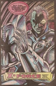
The rest of Liefeld’s X-Force series has not aged well. That’s not to say there isn’t some nostalgic fun to be had. There are also some fantastic lessons to be learned from it. But unless you were a certain age when it came out or you’re a comics historian, I’m not sure it has anything to offer.
As Rob takes on more duties (covers for other books, plotting his own), he starts to get both lazy and overly indulgent here. His focus shifts purely to his strengths — character design, texturing/cross-hatching, dynamic poses. The first thing this does is make his work impossible to ink or color. When this happens, it draws his baffling posing anatomy into starker relief (particularly as the first became a parody and the second a distant afterthought).
All of this means meant Rob was doubling and tripling down on the only things that “work.” And that’s how you get women who are footless and 13-heads high. That’s how every cover begins to feature Cable with biceps like boulders and a chest the size of a steakhouse.
Writing
This is where I’m the most biased. Simply put, I have never, ever liked Rob’s writing. His visual storytelling? Sure. His character designs? Guilty (I was 12). But his writing?
Rob has none of the grit of Chuck Dixon or Frank Miller; nor the charm of Larry Hama; nor the dizzying scope of Jim Starlin. And yet Liefeld’s work is constantly begging for comparison to these three. (Especially Miller and Hama’s individual Wolverine runs.)
Instead what you get is Cable, a character with flash and promise… but in Rob’s hands, it’s pure confusion and unmet potential. His utterly impenetrable backstory (which X-Cutioner’s Song only made worse). The Days of Our Lives episode that was his relationship with Strife. The fact that Cable’s entire characterization starts and stops with grunting and cybernetics.
I can only assume that Rob’s plotting process involved him screaming verbs at an action figure until the deadline came and went. At which point someone made Fabian Nicieza stop crying long enough to give something to the letterer. This theory is supported by the fact that the Deadpool most people know now isn’t the work of Liefeld at all. Writer Joe Kelly and artist Ed McGuinnes were the ones that created “The Merc with the Mouth” version of Deadpool, who immediately and irrevocably replaced the humorless musclehead that Rob first fashioned. And it was Christopher Priest that locked-in Kelly’s humor and cemented Wade’s constant breaking of the fourth wall. These two, along with Rick Remender’s Uncanny X-Force, are frequently held up as the definitive runs for fans. In my opinion, even Nicieza’s 50-issue run on Deadpool & Cable holds up better than Liefeld’s Cable & Deadpool.
Co-Founding Image Comics
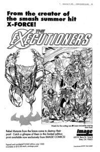
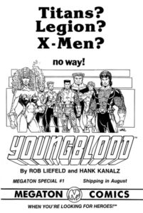 As I said, 1991 was the height of Rob’s stardom at Marvel. X-Force and X-Men had caused a tide that raised all mutant books, so while Rob’s output was starting to show signs of trouble, his readership was only rising.
And then Rob did the single dumbest thing in his life: he put out this ad for Malibu comics. Followed shortly after by this ad for Youngblood.
After this, Rob was out at the big two.
Jumping ship
Thankfully, Rob caught another rising tide: Image Comics. Joining up with the likes of Todd McFarlane, Jim Lee, and Erik Larsen as co-founders of this new venture meant that Rob was at ground zero for a brand new revolution in the medium.
And for a second time, Rob Liefeld helped change the way comics were made and sold. No matter what else I say, no matter what criticisms I have, this fact deserves recognition and respect from every single comic fan. The creator rights, improved coloring techniques, and increased production quality that he helped pioneer are essential to everything we know about modern comics.
Unfortunately, it also meant that Rob Liefeld was now co-president, with no editor above him. This meant that Rob was free to indulge his style to it’s fullest extent.
And that meant ripping off the big two.
Swipes
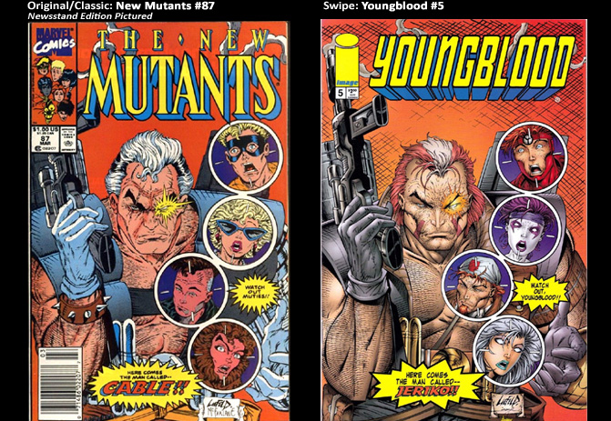
Deadpool — specifically, Rob Liefeld’s version of Deadpool — is famously a copy of Deathstroke. And since that worked out for Rob, it became a bit of a bad habit for him at Image (with its relaxed approach to legal oversight.)
Rob created teams like New Men, Bloodstrike, Youngblood, and Brigade which are just four of his attempts to rip off the X-Men. The first of which resulted in legal action; the last two we’ll see again later.
Each of those teams were comprised of various characters who were, themselves, swipes. Including::
- Fighting American (Captain America)
- Deadlock (Wolverine, but with Faust’s clothing)
- Troll (Tiny Beast with Wolverine’s haircut)
- Roman (straight-up Namor)
- Seahawk (Wolverine + Namor, but with a dumb Strife helmet)
- Warwolf (Sabertooth on laundry day)
- Sentinel (Warmachine + Iron Man. Looks more like Cable + Bishop)
- Cabbot (Deadpool + Cable)
- Smash (Hulk painted purple)
- Supreme (A boring Superman analog; more on him later)
Naming Conventions
Looking at that list, we are reminded of another peculiarity of Rob’s. We often discuss Rob’s art foibles, but for my money, his naming of things was where he really broke comics.
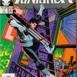
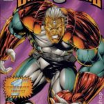
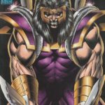
I want you to look at these three covers and imagine you don’t know their heroes. What information can you glean from their titles and motifs?
Now, go in cold on these three number 1 issues, try to do the same.
Tell me, what do any of these people do? I ask this because only one of them is from the future and one from Arthurian times, and you’d think you could tell which was which.
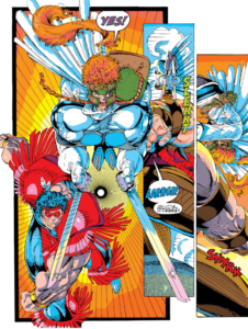
Total confusion
Of course, Rob’s awful appellatives weren’t born at Image. At Marvel he created characters like Genisis, Phantasia, and Shatterstar, none of whom were properly described by their callsigns. And yet somehow it feels so much more tired at Image. I mean, why the hell is “Knightsaber” named after a sword that knights did not use? And why is his weapon a light-up staff? And why isn’t he in armor?!
I know this seems like a small thing to harp on, but how did Rob Liefeld — perhaps the greatest comic marketer since Stan Lee — miss this remedial chapter in comics? How would I as a comic fan see a cover of “Prophet” and distinguish him from any of the other characters Rob churned out that month?
Awesome Comics
Ousted from Image
The official story from Image top brass is that in 1996, Rob Liefeld was about to be fired. The exact reasons depend on the telling. But three main reasons come up again and again:
- According to the Image press release, Rob was fired. Allegedly, for misusing his position as Co-Founder to promote a rival publisher that he himself created, as well as poach talent from the Image stables.
- Rumour is before this, Mark Silvestri left Image on account of Liefeld. If true, that means Liefeld would have pushed Silvestri into the open arms of Malibu, where Silvestri helped create Witchblade and The Darkness. (Two of Spawns biggest sales competitors)
- Anonymous sources have described a pattern of verbal abuse from Liefeld. One that simply made his contributions impossible.
Regardless of the reason, Rob allegedly resigned in the press while the meeting to fire him was taking place. He also announced he was launching his own imprint, Awesome Comics.
Because of course that’s what he’d name it.
Learning Lessons
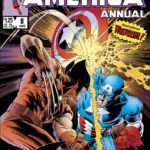
Looking at it one way, this imprint was a continuation of Liefeld’s bad habits. Rob would put out more comics that were straight rip-offs of other properties, most notably his Agent America/Fighting American who was such an obvious proxy that Marvel actually took him to court. There was a trial and everything.
But on the other hand, being apparently booted from Image must have been a colossal blow to Liefeld because his art appears to change a bit for the better at this period. Sure, his characters might be rip-offs, but at least their proportions were getting closer to “normal,” and Rob actually attempted to ground them. Sometimes.
But maybe the most impressive thing of all was how Awesome comics kickstarted the careers of people like Jeph Loeb, Jeff Matsuda, Ian Churchill, and more.
Most critically, however, was how Rob learned to let other people play with his toys.
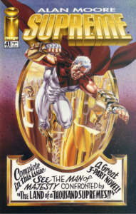 Alan Moore’s Supreme
Rob created Supreme at Image, turning in a pretty bog-standard Superman. It ran for a few dozen issues before Rob took it over to Awesome comics, and went for a few dozen more before having a moment of clarity and asking Alan Moore to take over. And to everyone’s surprise, Moore did.
Starting with #41, Moore was permitted to completely re-invent the character. His Supreme was filled with comics history, delightful cliche, and a palpable love for the original Superman inspiration. Moore has gone on record saying this book was an “apology” for his previously dark and cynical works. And when the book is good, it feels like that.
And then Rob Liefeld ruined it.
Rob takes his toys, goes home
Moore left the book while it was still receiving shocked acclaim. Rob held up the release of his final scripts while working with Erik Larsen (another infamous Image creator with a problematic past) to reboot the book in the worst way possible.
The two scripted out a new series that had “the Real Supreme” (the pre-Moore, Liefeld-only version) return and literally blow up everything Moore had made. Not only was the progress destroyed, so was the tone of the book. It ran only four issues before collapsing.
Such a waste.
Return to Marvel
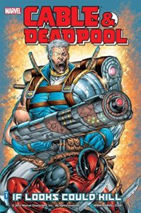 Deadpool’s post-2015 wave of popularity brought Rob back into Marvel’s good graces. Suddenly there was a concerted push to get Rob back on the characters he created with titles like Cable & Deadpool and Deadpool Corps. (The latter of which is still a fantastic pun).
And to his credit, Rob put out his best work in decades. Gone was the abundance of hatch lines. Gone was the profusion of pouches, bandoliers, and pads. Even the anatomy was getting better. Rob even made a real point of grounding his characters on their own two feet.
There were still insane guns and an apparent “buy one, get twelve free” sale on bladed objects. But it never got out of hand. And when Rob was swiping, he was mostly swiping from himself.
This was a mature Rob Liefeld.
But Liefeld’s big contribution was going to be a brand new character in the X-Books.
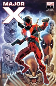 Major-X
There are two things Rob Liefeld cannot leave alone in this world: Time Travel and the Summers Family.
Major-X was supposed to be a brand new addition to Cable’s Askaniverse, the one where Apocalypse’s vision for the future has come to pass. I get the feeling it was also Rob’s attempt to make good on X-Cutioner’s Song.
Instead, we got a Rob Liefeld’s worst hits: a Cable-centric story involving convoluted time travel, vague missions/prophecies, grim anti-heroes, unhelpful names, grimacing faces. The covers are a dramatic backslide from Liefeld’s work on Cable & Deadpool.
Having read all six issues of this mini-series, all I can tell you is who is related to whom, and what everyone looked like. I can’t name a single power that Major X has. I don’t even know if he has powers. And after several minutes of Googling, I’m not sure anyone else does, either.
Kickstarter, Social Media, and Our Terrible Modern World
 As of 2019, Rob Liefeld finds himself a man with very few comrades.
He has spent the last two decades picking pointless fights. He has gotten into it with old friends Louise Simonson (writer on New Mutants), Fabian Nicieza (writer on Deadpool), and Jeph Loeb (Awesome comics). He’s subtweeted Scott Snyder for his Batman sales success. He’s fought the New York Times, Newsarama, and Bleeding Cool, all of which are too dumb to link. Rob has had a spectacular freakout at DC. He quit Twitter a couple of times, and then rejoined just to yell at his fans.
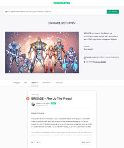
And god, is there any comic creator going who is worse to their fans? Rob took $35,000 dollars from a Kickstarter (left) and nearly $6,000 more from a separate IndieGoGo in order to produce a Brigade book. He goes back on his promise to include an IP that he created (Youngblood) in the book because he pissed off the co-creators. And just now, six years to the month, the compromised result is supposedly going to print. For a total of I believe 500 units.
I am at a loss for why this is happening and continues to happen. Or why this man seemingly cannot endure anything other than unalloyed worship. So I say this with sincerity: We can only surmise that there is no one in Rob Liefeld’s life that can prevent him from being exploitative of his friends, his fans, or himself. Because if there were, this would have stopped.
Conclusion
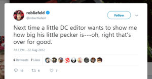 I said at the start of this that I would keep my jokes to a minimum because this wasn’t the treatment that Rob Liefeld deserved. And that’s true. He does not. Ultimately, it doesn’t matter that Rob doesn’t know anything about torsion or that he couldn’t find a second act to save his soul. These facts have not hurt this world or Rob Liefeld one bit.
What does matter is that every day, and at every turn, Rob Liefeld goes out of his way to be a cruel, petty, self-aggrandizing nightmare. He treats his collaborators with contempt. His fans with derision. His whole industry with scorn. At the slightest provocation, Rob is seemingly prepared to ruin his entire career.
I told you that Rob Liefeld doesn’t deserve humor. This is because humor only distracts from the problem. Mocking his love of pouches and shoulder pads would only lessen the questions we’re all left with:
- Rob Liefeld is a marketing genius whose name alone will sell any book he’s on. So why can’t he give himself away?
- Rob Liefeld has squandered talent, friendship, and goodwill at every opportunity. So why does he still have his fanbase?
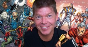
Ultimately, there are two Rob Liefelds. One is the genius, the rainmaker, the man of every hour. A 51-year-old millionaire who has redefined the very medium he works in.
The other is selfish, wounded, and friend to no one. A vindictive child fired from or bankrupted every publisher he’s been a part of for 30 years. Every last one.
There are two Rob Liefelds. And I fear that the one who wins is the one we feed more.
Excellent article!
What was Rob Liefeld’s first comic book artwork?
I had hoped you might have info on some of the Awesome Comics runs that petered out with Rob not paying creators yet publishing their works. Youngblood by Moore/Skroce being one I believe (though I heard Moore was paid unlike Mr. Skroce). Never did find out all the info on those.
I’m amazed on how you did not mention the smiles of his drawings with 50 or more teeth, or the eyes always in the wrong position or his very bad use of perspective. Or how he’d fill a page with panels of bird’s eye view of running characters. To mention a few…
One can only gaze so long into any abyss…
OMG I used to love counting teeth and toes…
Just one minor point: the Youngblood preview add came out in the ’80s, before he worked for either Marvel or DC, and was published by Megaton Comics, not Malibu.
Now come on, you can’t say you’re not going to give us any humor, then 4 sentences later hit us with a line like “Then there’s his writing, which feels like a Michael Bay movie powered by irradiated cocaine.”
🤣
Seriously, this was a great breakdown of his career and the pros & cons of it. Thanks!
I don’t think John could write a piece without one memorably hilarious line if he tried – and this is the proof!
Glad you enjoyed the read, I really did too, but of course I’m biased 🙂