Editor’s Note: Although I remain in a state of X-Men induced delirium inspired by the Jonathan Hickman written House of X / Powers of X era, the writer somehow found time to kick off an 8 issue Image Comics series, Decorum, with artist Mike Huddleston. The oversized opening issue is a fascinating blend of hard science fiction (reminiscent of Powers of X) and space assassins operating in the seedy underbelly of a developing galactic superstructure.
Since Decorum is full of fluid visuals and challenging science fiction, I recommended the book to Comic Book Herald’s writer supreme, John Galati. Naturally, John responded with an annotated array of thoughtful notes, comparisons, and critiques. Check it out below, and then check out Decorum #1 for yourself!
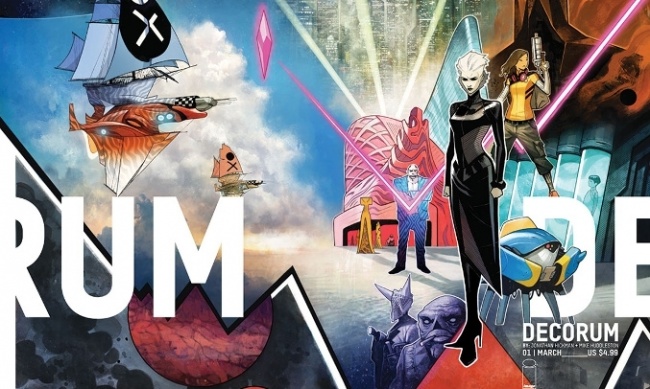
PRAISE
All my favorite influences:
- The overall aesthetic is very Bill Sienkiewicz meets Black Science
- Character designs are half Paul Pope, half Sean Gordon Murphy
- Robot designs feel a little Moebius, a little Masamune Shirow, maybe a pinch of Battletech.
- Ship design feels very Gareth Bourn (“No Man’s Sky”)
- Punk Zine, sketch and paste-up reminiscent of Jim Mahfood. (page 37)
- Hints of Ashley Wood and Jonathan Wayshak all over the place.
- Those gorgeous Frank R. Paul planets!
Smart Choices
- I absolutely loved the Star Wars style “lived in” universe, particularly the use of older architecture elements. The Islamic window treatment set against Terry Gilliam’s 70s/80s office design on page 29 is brilliant.
- Colorful nature is so much fun. See: Top Left Panel – Thug’s suit (p. 44)
- I’m always going to love a futuristic courier or trucker story. Anything even remotely like Snow Crash will always be on my must-read list.
World Buildings
- I love the wild collision of concepts. Galactic criminal enterprises, strange religious interests, fun aliens/robots, and fever-dream designs color every turn. Even the subtle pulp hints like the pirate ships, the “Marakesh” style city, cyberpunk neon dystopia, and shifting between high- and low-brow styles all create a book that feels exciting, rich, and vast.
- That said, it’s little ideas that really make the difference here. A liquid planet with so much satellite interference that its tidal forces meaningfully change the diameter and circumference of the world. A graph that shows a monolith/obelisk’s appearances, subtly highlighting that its patter is increasingly erratic over time. I am here for these things.
CONCERNS
- Character expressions don’t always match dialog (Page 28, 29)
- Graphic design is poor – their column and grid structures seem inconsistent at best (pg. 24-25). This could be a designer struggling to work in someone else’s (Hickman’s) style. Or it could be a bigger problem. No way to know the reason right now, only that it’s a uzual strength of Hickman’s books that’s now glaringly not.
- Inconsistent exposition – Why does a ramen diagram need an entire page? Why do the Bouweriz get a name, but the intergalactic plague is only called “the plague?”
- Stilted dialogue – (Page 44) “Excuses are what the mediocre call home, and for the tardy there are none.” -> Why are “mediocre” and “tardy” mutually exclusive? What exactly separates the two? And which is the courier supposed to be? This painful posturing goes on through that entire sequence. Hickman’s normal style trades on “sage wisdom” quite a lot (Avengers, East of West, Secret Wars), but being so lofty is a precarious high-wire act… and one I think this particular issue falls off of often.
THE PROOF IS IN THE PEDANTRY
What’s Kling for “irony?” – For more than 30 years, Hollywood has been spoiling sci-fi fans with language. Not content to provide only nouns like the names of characters, races, places, and ships, modern sci-fi has embraced linguistics in a big way. Just a few highlights include:
-
- Star Trek III (1984) – “Klingon,” a primarily spoken language with some distinct words (lexical), aphorisms (idiomatic), and a rough structure (grammatical). It’s also a written language, with a unique alphabet that adheres to a number of typographic principles.
- Fifth Element (1997) and Lord of the Rings (2001) – Advanced languages, using not just words and structure, but vocal emphasis (phonological) and relative meaning (syntactical). Again, both of these have their own, proper typography.
- Firefly (2002) – A blended, hybridized language mixing elements of English and Mandarin (pidgin or creole, depending on the speaker.)
This brings us to Hickman’s and his noted use of alien scripts. However, regardless of what CBR and other outlets might tell you, Jonathan Hickman does not create languages; he creates ciphers. And understanding the difference between these things is foundational when talking about Hickman’s work. I’ll give a quick, 60-second summary here.
Understanding Language Made Entirely Too Simple
As noted earlier, languages are sophisticated tools. How they sound, their vocabulary specializations, and their grammar/sentence structures give enormous insights into the people who created them, the place and time they lived, and what they likely thought about. Even something seemingly trivial, like how older languages are more likely to be minor, like whether a language is written left-to-right or right-to-left, top-down or bottom-up, tells us who was using that writing system, how widespread literacy was likely to be at the time, and more. Language is this and so much more.
And that’s not at all what Hickman does. I’ll use all Krakoan for all of my examples, but you can do the same with his other works and get similar results.
On Writing
Speaking very loosely, Hickman starts by making what is essentially a typeface for his new “language.” These are simply a series of 26 symbols, each a replacement for an English character (I’ll get to his “special” characters in a second). Instead of our Latin letters, Hickman uses geometric characters.
But otherwise, the two languages are very nearly identical in their lexicon, grammar, syntax, etc. This, right here, is why Karkoan is not a language. Instead, it’s a substitution cipher like the old “decoder ring” puzzles or the games you see on the front of kid’s placemats or the backs of sugary cereal… with those “SH,” “TH,” and other special characters being one extra level of sophistication.
Instead, Hickman’s focus is on building “readable” glyphs. By using changing line weights, slightly shifting dimensions, and a shared geometric sensibility, Hickman uses subconscious elements we recognize as belonging to letterforms to create an alien script that’s “readable” if not yet legible. In other words, your mind realizes it’s looking at a language… just in a language, you can’t (yet) read. Most impressively, the letterforms use their squares, lines, dots, and circles at various levels of completion to give a hint at the mathematical progression! I find this awesome (even if it does hurt “legibility.”)
The point being, every decision Hickman makes with these languages is to keep them as a simple puzzle used to regulate the reader’s progression through a larger mystery.
How Decorum’s Language Problems Mirrors its Overall Problems
Decorum builds its “language” through obvious permutated Latin characters and Asian Logograms. Not only are these identifiable (which is linguistically confusing) but their aesthetics are not well matched. This means, unlike Krakoan, reading Decorum’s script is a repellent exercise. It’s simply too discordant.
First, I thought this might be an intentional choice — maybe a call back to the cut and paste, serial killer letter aesthetic of early punk. But as of right now, there’s not enough evidence to support that. Then I thought it might be an attempt at a pidgin between the languages… but so far there are no idioms, greetings, aphorisms, or expletives to support that either.
I realize that we only have one issue to go on, but these “languages” are characteristically a strength of Hickman. Much like his graphic design. And that they should be struggling so greatly has me concerned.
Because as of right now, I feel like the language, like the graphs, don’t exist because they’re efficient. Nor do I feel they’re being done as a show of skill and pride. I think they’re in this book because someone is thinking “it’s not a Jonathan Hickman book without them.”
FINAL THOUGHTS
There’s an absolute ton of promise in this book. The parts that work right are gorgeous and I fully expect to improve from there. But the parts that don’t work for me are troubling. It’s like this book is trying really, really hard to be “a Jonathan Hickman book” instead of being “Decorum” by Hickman and Team. There’s a real tension between the book’s freewheeling outside influences (Sienkiewicz, Mahfood, vintage pulp) and the hyper-detailed, exhaustively planned masterpiece that is Secret Wars. I’m certain that this team could change nothing and still produce a good read… but ironically, I think all this additional effort of trying to be two works might hold them back from being one spectacular world.
Leave a Reply